How To Read Candlestick Charts For Day Trading
Reading candlesticks is very important to trade in the stock markets. Learn how to read them and the different chart patterns, used to identify trends.
Introduction
Imagine being a trader with a few years of experience, and someone asks you, pointing at the intricate candlestick patterns on your screen, "What do these patterns mean?".
What if you're not quite versed in the language of these patterns in such a situation?
Don’t worry; you will know all about candlesticks by the time you reach the end of this blog.
With their roots tracing back to 18th-century Japan, candlestick charts have evolved into a global language spoken by traders with 42 candlestick formations that are recognised until now. Today, they're the go-to choice for traders across various markets, from stocks to cryptocurrencies.
As you dive into this blog, you'll grasp the art of interpreting candlestick charting, candles in the stock market, intraday candlestick patterns, and more. So let’s get started.
What are Candlestick Graphs/Charts?
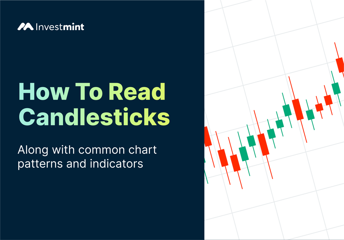
A candlestick trading chart is a type of graph used in finance to show how the prices of things like stocks or cryptocurrencies change over time. They're made up of vertical bars called "candles."
Each candlestick has a rectangle in the middle and lines sticking out from the top and bottom. The rectangle shows the range between the opening and closing prices for a specific period, like a day. If the closing price is higher than the opening price, the rectangle is usually shaded or coloured. The rectangle might be left empty or a different colour if it's the reverse.
The lines above and below the rectangle are called "wicks" or "shadows." They show the highest and lowest prices during that time. It gives you an idea of how much the price went up and down.
So, by looking at these candlesticks in a row, you can see the pattern of price changes. It's a handy way for investors and traders to quickly understand how a stock or other asset has been performing over time, helping them decide when to buy or sell.
Composition of a Candlestick Chart

How to Analyse Candlestick Chart?
Analysing a chart candlestick involves observing patterns and trends to understand the price movement of a financial asset. Let’s understand this process better.
Understand Candlestick Components:
Start by familiarising yourself with the basic components of stock market candles:
- Body: The rectangular part represents the price range between the opening and closing prices.
- Wicks (Shadows): The lines above and below the body show the highest and lowest prices during the period.
Select a Time Frame:
Choose a timeframe that suits your analysis. It can be 1, 5, 15 minutes, hours, days, weeks, etc. Each candlestick will represent the selected timeframe.
Identify Candlestick Patterns:
Look for patterns formed by multiple candlesticks. Some common patterns include:
- Doji: When the opening and closing prices are very close or nearly the same.
- Engulfing: One candlestick "engulfs" the previous candlestick's body, indicating a potential reversal.
- Hammer and Hanging Man: These single candlestick patterns have a small body and a long lower wick, signalling potential reversals.
Recognise Trend Patterns:
- Uptrend: A series of higher highs and higher lows. Look for longer bullish (green) candlesticks in the stock market.
- Downtrend: A series of lower highs and lower lows. Pay attention to longer bearish (red) candlesticks in the stock market.
Apply Indicators:
Combine stock market candlestick analysis with technical indicators (like Moving Averages, Relative Strength Index (RSI), and MACD) to improve your understanding.
Consider Support and Resistance:
Identify key support (price level where a decline may stop) and resistance (price level where an increase may stop) levels on the chart. These will help you anticipate price movements.
Volume Analysis:
Consider the trading volume associated with stock market candles. Higher volume during specific price movements can indicate strong market sentiment and potential trend continuation or reversal.
Confirmation:
Look for confirmation from other indicators or candlestick chart patterns. Multiple indicators aligning provide stronger signals.
Timeframes Comparison:
Compare the analysis on different timeframes. Shorter timeframes offer more detailed insights into intraday movements, while longer timeframes show broader trends.
Risk Management:
Always consider risk management strategies before making any trading decisions. It's important to protect your capital.
Candlestick Pattern Chart
Bullish Patterns:
- Hammer: Hammer suggests that sellers tried to push the price down, but buyers stepped in, pushing the price back up. It can also signal a potential upward reversal.
- Bullish Engulfing: Here, we have two consecutive candlesticks, where the second one completely engulfs the body of the first. It shows a shift from selling to buying pressure.
- Piercing Line: It's a two-candle chart with the second opening lower than the first's close but closing above the first's midpoint. It suggests a potential reversal after a downtrend.
- Morning Star: This is a three-candle chart: a bearish candle, followed by a small candle, and then a bullish candle. It indicates a possible reversal from a downtrend to an uptrend.
Bearish Patterns:
- Shooting Star: In this, the candle has a small body at the bottom and a long upper wick. It suggests that buyers pushed the price up, but sellers came in and pushed it down, signalling a potential downward reversal.
- Bearish Engulfing: Similar to the bullish engulfing but in the opposite direction. Here, the second candle covers the first one, indicating potential selling pressure and a shift to a downtrend.
- Dark Cloud Cover: This is another two-candle pattern. The first candle is bullish, but the second one opens higher than the previous close and then closes lower, covering at least half of the first candle's body. It suggests a potential reversal to a downtrend.
- Evening Star: It’s just like the morning star but in reverse. The first candle is bullish, followed by a smaller candle indicating uncertainty. The third candle is bearish and larger, showing potential for a reversal.
Best Candlestick Patterns for Day Trading
Every trading has different patterns; the best pattern cannot be decided with data alone. Still, experts suggest that these are some of the best candlestick patterns for day trading.
Bullish Patterns:
- Bullish Engulfing: Strong upward reversal signal.
- Hammer: Potential bullish reversal.
- Morning Star: Trend shifts to bullish.
Bearish Patterns:
- Bearish Engulfing: Strong downward reversal signal.
- Shooting Star: Potential bearish reversal.
- Evening Star: Trend shifts to bearish.
Indecision Patterns:
- Doji: Market uncertainty, potential reversal.
- Dragonfly Doji: Potential bullish reversal.
- Gravestone Doji: Potential bearish reversal.
Do keep in mind to do your own research before following these patterns for investing.
Conclusion
With the knowledge gained, you're now ready to approach the fast-paced world of day trading with newfound confidence and insight. Now, these patterns will no longer feel alien. A bit of practice and time will do the charm for you. Successful day trading is about reacting to market movements and anticipating them. Mastering candlestick charts is a skill that sharpens your intuition, deepens your understanding of price action, and elevates your ability to read the market language.
FAQs
Q. What is a share market candle chart, and how is it used in day trading?
A share market candle chart visually represents price movements using candles. Day traders use it to spot patterns like Engulfing and Doji, which suggest potential price reversals or trends, helping them make short-term trading decisions.
Q. What do the different colours of candlesticks represent?
Candlestick colours: Green (bullish) means the price closed higher than the opening price, signalling strength. Red (bearish) indicates the price closed lower, signalling weakness. Colours help traders quickly see market sentiment and potential trends.
Q. What are some common stock market candlestick patterns that traders look for?
Traders look for patterns like Bullish Engulfing, Hammer (reversals), and Doji (indecision). Evening Star, Shooting Star (reversals), and more indicate potential price shifts, helping decision-making.
Q. How can candlestick charting be used in conjunction with other technical indicators?
Candlestick charting works with indicators like Moving Averages, RSI, and MACD. Combining patterns and indicator signals provides a comprehensive view, improving accuracy in predicting price movements.
Q. How do I use candlestick charts to make trading decisions?
Observe candlestick patterns for trend reversals or continuations. Confirm with indicators and consider support/resistance levels. Use patterns as signals, manage risk, and stay informed about market conditions.